ShopDreamUp AI ArtDreamUp

Deviation Actions


Suggested Deviants


Suggested Collections


![..[Bad Time]..](https://images-wixmp-ed30a86b8c4ca887773594c2.wixmp.com/f/dbffc01a-08a2-4238-a73c-7c04eb4b0a12/d9fk2hv-a4ac9561-7d25-40a0-8e3b-78e1168dd5bd.png/v1/crop/w_184,h_184,x_0,y_48,scl_0.18833162743091,q_70,strp/___bad_time____by_traumlaterne_d9fk2hv-92s-2x.jpg?token=eyJ0eXAiOiJKV1QiLCJhbGciOiJIUzI1NiJ9.eyJzdWIiOiJ1cm46YXBwOjdlMGQxODg5ODIyNjQzNzNhNWYwZDQxNWVhMGQyNmUwIiwiaXNzIjoidXJuOmFwcDo3ZTBkMTg4OTgyMjY0MzczYTVmMGQ0MTVlYTBkMjZlMCIsIm9iaiI6W1t7ImhlaWdodCI6Ijw9MTIyOSIsInBhdGgiOiJcL2ZcL2RiZmZjMDFhLTA4YTItNDIzOC1hNzNjLTdjMDRlYjRiMGExMlwvZDlmazJodi1hNGFjOTU2MS03ZDI1LTQwYTAtOGUzYi03OGUxMTY4ZGQ1YmQucG5nIiwid2lkdGgiOiI8PTYwMCJ9XV0sImF1ZCI6WyJ1cm46c2VydmljZTppbWFnZS5vcGVyYXRpb25zIl19.J7ayD-k8uzYRR9pQDBkky0uRBaEVa-o0TJ99AS7uWZw)
![..[Bad Time]..](https://images-wixmp-ed30a86b8c4ca887773594c2.wixmp.com/f/dbffc01a-08a2-4238-a73c-7c04eb4b0a12/d9fk2hv-a4ac9561-7d25-40a0-8e3b-78e1168dd5bd.png/v1/crop/w_92,h_92,x_0,y_24,scl_0.094165813715455,q_70,strp/___bad_time____by_traumlaterne_d9fk2hv-92s.jpg?token=eyJ0eXAiOiJKV1QiLCJhbGciOiJIUzI1NiJ9.eyJzdWIiOiJ1cm46YXBwOjdlMGQxODg5ODIyNjQzNzNhNWYwZDQxNWVhMGQyNmUwIiwiaXNzIjoidXJuOmFwcDo3ZTBkMTg4OTgyMjY0MzczYTVmMGQ0MTVlYTBkMjZlMCIsIm9iaiI6W1t7ImhlaWdodCI6Ijw9MTIyOSIsInBhdGgiOiJcL2ZcL2RiZmZjMDFhLTA4YTItNDIzOC1hNzNjLTdjMDRlYjRiMGExMlwvZDlmazJodi1hNGFjOTU2MS03ZDI1LTQwYTAtOGUzYi03OGUxMTY4ZGQ1YmQucG5nIiwid2lkdGgiOiI8PTYwMCJ9XV0sImF1ZCI6WyJ1cm46c2VydmljZTppbWFnZS5vcGVyYXRpb25zIl19.J7ayD-k8uzYRR9pQDBkky0uRBaEVa-o0TJ99AS7uWZw)


You Might Like…


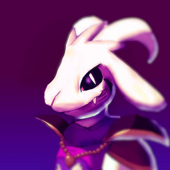
Description
*pops out of coffin* HENLO DEVIANTFGART
THIS!!!!!!!!!!TOOK LIKE 3 FUCKIGN DAYS BUT I HOPE IT WAS WORTH IT EVEN THOUGH MOST PEOPLE HATE UNDERTARTS NOW!!!!!!!!!!!!!!!!!!!!!
drawn trafiitonclay and colored digtialy
critlicks are welcome
uncolord image
THIS!!!!!!!!!!TOOK LIKE 3 FUCKIGN DAYS BUT I HOPE IT WAS WORTH IT EVEN THOUGH MOST PEOPLE HATE UNDERTARTS NOW!!!!!!!!!!!!!!!!!!!!!
drawn trafiitonclay and colored digtialy
critlicks are welcome
uncolord image
Image size
2330x1685px 32.48 MB
© 2017 - 2024 parrotte
Comments40
Join the community to add your comment. Already a deviant? Log In
To keep it Short and Sweet™ I'm going to make a pros and cons list ;D
Pros:
- It's very detailed and intricate; I can tell you spent a lot of time on it!
- The technique you used is very unique! I love how it was sketched traditionally; I don't see that a lot on dA.
- The anatomy is on point
- The shading is just enough to add the right amount of contrast
Cons: (they're not really cons, just things I think could use some work)
- The coloring is very muted, which I think adds to the atmosphere of the piece. Despite this, there's nothing that really pops out to me. You could've brightened up Alphys slightly, although I understand why you chose not to
- Something that migh've helped to add more depth was adding blurs, or parts that were more out of focus. I see how you faded out the table and that one little guy in the bottom left of the piece, but I think if you even went so far as to blur the background or the limbs of some of the other monsters it would really add to the effect this artwork has.
That's all I've got for you! Overall, this is just wonderful <3 I hope this critique helps <img src="e.deviantart.net/emoticons/e/e…" width="15" height="15" alt="